Pedagogical dashboards: tracking progress without overload
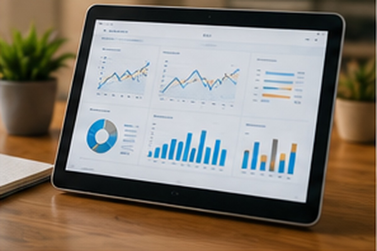
Many teachers and administrators accumulate data on student progress — exam results, attendance, assignment submissions — without necessarily having a simple way to interpret it collectively. That's where a well-designed pedagogical dashboard delivers real value, often underestimated before actually trying one.
The problem a dashboard solves
Without a tool to aggregate data, a teacher often has to check several separate sources to get an overview of a group's progress. That process takes time and makes it harder to quickly spot concerning trends that would benefit from early intervention.
What a good dashboard should offer
A clear, synthesized view, rather than a pile of raw numbers. The ability to quickly identify students who need particular attention. And above all, a presentation that supports decision-making without requiring advanced statistical analysis from a teacher checking the tool between class periods.
The risk of information overload
A poorly designed dashboard can produce the opposite of the intended effect: too much data presented without a clear hierarchy, adding confusion instead of clarity. The quality of the tool's design matters as much as the quantity of data available, if not more.
Use at the school leadership level
Beyond the individual teacher, school leadership can use aggregated data to spot trends at the program level — a concept that consistently trips up several groups, for example. That information can inform decisions around professional development or curriculum adjustments at a more strategic level.
Keeping the human element central to interpretation
Dashboard data directs attention, but never replaces the knowledge a teacher has of their students. A concerning number always deserves to be interpreted in light of the classroom's real context, not treated as an automatic conclusion that excuses further thought.
An example of successful use
An administrator who notices, through an aggregated dashboard, that a specific concept is causing trouble across several groups in the same course can organize a meeting between the teachers involved to compare how they're each teaching that concept — a collective use of data that goes beyond tracking a single student.
One last design benchmark
An effective dashboard should be able to quickly answer a simple question from a teacher checking in between classes, without requiring deep exploration of menus or complex filters to find the information they're looking for.
A dashboard that respects this principle of simplicity quickly becomes a tool staff consult naturally, rather than one more system they have to remember to check occasionally.
A school leader who invests in the quality of a dashboard's design, rather than the sheer quantity of data displayed, generally ends up with a tool that gets used more — and is therefore more useful day to day.
It's a simple principle, but one too often overlooked in favour of features that look more impressive on paper.
That discipline is easy to state and genuinely hard to maintain, which is exactly why it's worth calling out explicitly.
That focus on clarity over volume is what separates a dashboard people actually use from one they quietly ignore.